
npx create-react-app toastifyexample
cd toastify
npm i react-toastify
Full Example with Source Code
App.js
import React, { useState } from 'react'
import './App.css'
import 'react-toastify/dist/ReactToastify.css'
import { toast, ToastContainer } from 'react-toastify'

function App() {

  const notify = (message, hasError = false) => {
    if (hasError) {
      toast.error(message, {
        position: 'top-center',
        autoClose: 5000,
        hideProgressBar: false,
        closeOnClick: true,
        pauseOnHover: true,
        draggable: true,
        progress: undefined,
      })
    } else {
      toast(message, {
        position: 'top-center',
        autoClose: 5000,
        hideProgressBar: false,
        closeOnClick: true,
        pauseOnHover: true,
        draggable: true,
        progress: undefined,
      })
    }
  }

  const showAlert = () => {
    notify("Hello world",true)
  }


  return (
    <div className='App'>

      <button onClick={showAlert}>
        Show Alert
      </button>

          <ToastContainer
            position='top-center'
            autoClose={5000}
            hideProgressBar={false}
            newestOnTop={false}
            closeOnClick
            rtl={false}
            pauseOnFocusLoss
            draggable
            pauseOnHover
          />
    </div>
  )
}

export default App
Here we have a simple button to show alert messages. When we click this button the toastify alert notification will show in the center position as we had given the position top-center. Now, if you run the app, you will see something like the below screenshot.

As you can see we are showing the error notification message. Now, to show the success notification you need to change the below code in App.js file.
App.js
import React, { useState } from 'react'
import './App.css'
import 'react-toastify/dist/ReactToastify.css'
import { toast, ToastContainer } from 'react-toastify'

function App() {

  const notify = (message, hasError = false) => {
    if (hasError) {
      toast.error(message, {
        position: 'top-center',
        autoClose: 5000,
        hideProgressBar: false,
        closeOnClick: true,
        pauseOnHover: true,
        draggable: true,
        progress: undefined,
      })
    } else {
      toast(message, {
        position: 'top-center',
        autoClose: 5000,
        hideProgressBar: false,
        closeOnClick: true,
        pauseOnHover: true,
        draggable: true,
        progress: undefined,
      })
    }
  }

  const showAlert = () => {
    notify("Data is inserted successfully")
  }


  return (
    <div className='App'>

      <button onClick={showAlert}>
        Show Alert
      </button>

          <ToastContainer
            position='top-center'
            autoClose={5000}
            hideProgressBar={false}
            newestOnTop={false}
            closeOnClick
            rtl={false}
            pauseOnFocusLoss
            draggable
            pauseOnHover
          />
    </div>
  )
}

export default App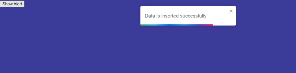
Themes of Notification Messages
Three themes are supported
- dark
- light
- colored
Types of Notification Messages
- error
- warning
- info
- success
- default